Adding Visualizations to a report
About This Guide
This guide is designed to walk users through adding a visualization to the example report. For this example, we'll create a chart visualization, keeping in mind that GeoCharts, Google Maps and gauges are other possible visualization types.
Adding a Chart

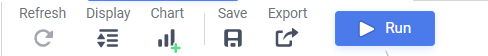
To add a chart, first select a cell in in the Report Footer and press the Chart Button () in the toolbar above the Design Grid.
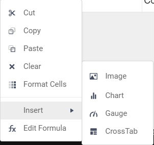
Or, right-click a cell in the Report Footer, hover over 'Insert' in the drop-down menu, and select 'Chart' from the second drop-down menu.
NOTE. Charts rely on aggregating data and are therefore best placed in a group or report footer.
The Chart Wizard
Appearance Tab
The Chart Wizard opens on the Type tab, where users may select the type of chart they wish to create. The charts are broken up into four groups: Line; Bar and Column; Pie and Other Single-Series; and Scatter and Bubble charts.
- Line: Line charts show trends in one or multiple data sets over time. These can be single- or multi-series.
- Bar and Column: Bar and Column charts compare values, aggregate values, and percentages to each other. They can be either single-series or multi-series.
- Pie and Other Single-Series: These display the parts of a whole in percentage point terms and only display one series at a time.
- Scatter and Bubble: Scatter and Bubble charts show the relationship between distinct data points in one or more series.
For this report, the desire is to show a chart that allows direct visual comparison of total revenue generated by each product. This is best accomplished with a bar or column chart.
Data Tab
The Data Tab is where data is refined for the selected chart and where the interaction of the data is determined. A data value and a data label for the chart must be set before proceeding.
For this chart, set the X-Axis Labels to Products.ProductName, and set the Series Values to the formula for product revenue, =[B5]*[C5], using the dropdown menus. Under Other Options, we will set the data values to sort in ascending order for quick comparison.
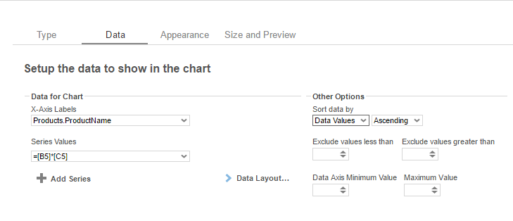
NOTE. Data Values must be numeric values.
Appearance Tab
In this tab, we can customize the chart's appearance by applying a theme, labels, number formatting, benchmark lines, and other features.
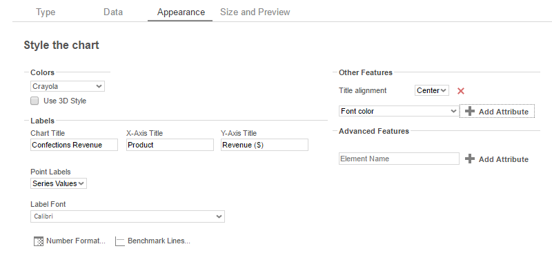
NOTE. The values set in the Appearance Tab are optional.
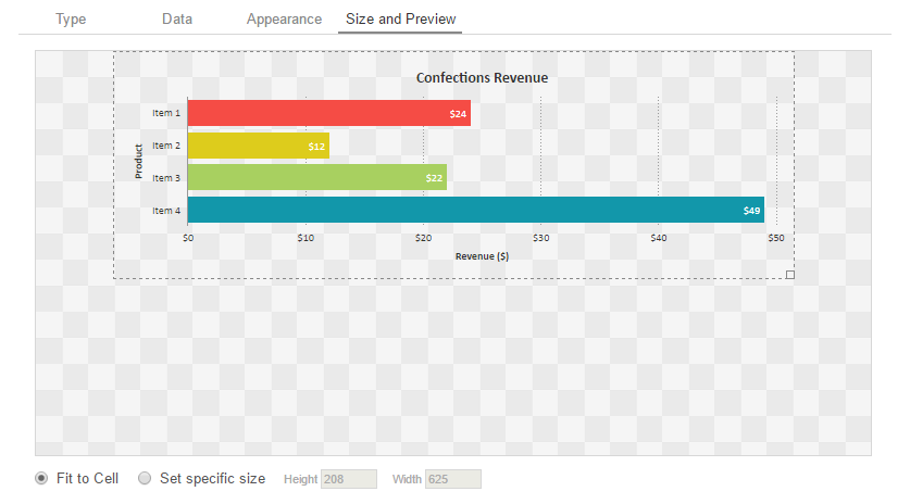
Size and Preview Tab
After the chart has been formatted, we can either press the Finish button to dismiss the chart wizard or move on to the Size and Preview Tab. The preview displays dummy data formatted according to the user's specifications and gives users the option to resize the chart.
Reading The Chart
Click Finish and execute the report to HTML. Below is the visualization we've just constructed:
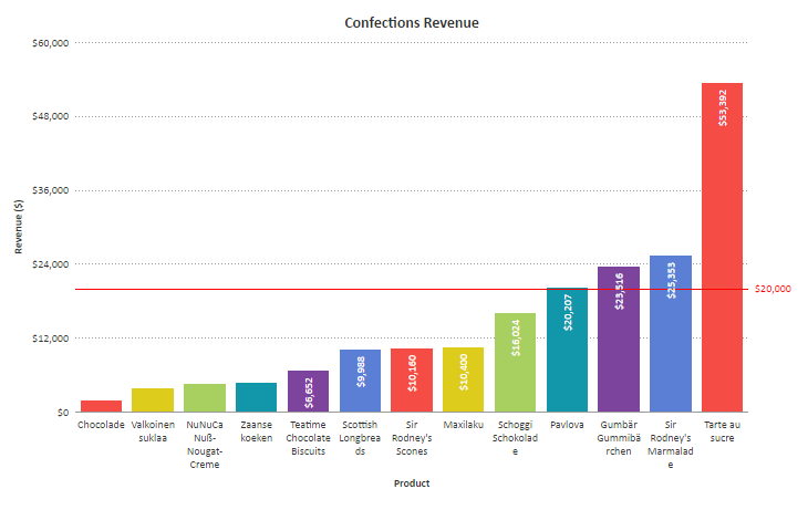
After execution, it is clear that Tarte au Sucre has generated the most revenue and that Chocolade has generated the least.
Interactive HTML
In the HTML viewer, users are able to make adjustments to the chart without having to re-execute the report. Right clicking on the chart will bring up a series of menus.
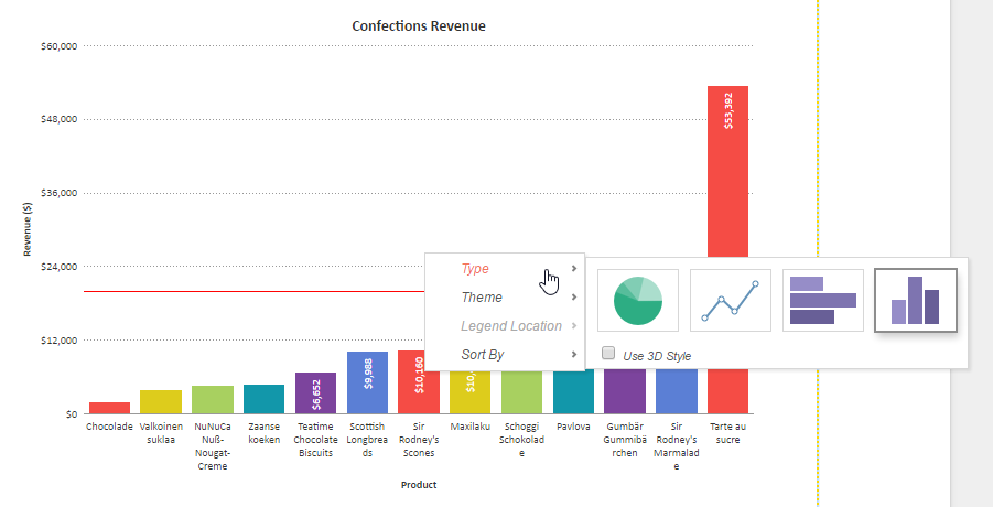
These menus include:
- Type – This allows users to change the chart type within the HTML viewer
- Theme- This allows users to change the theme of the chart within the HTML viewer
- Legend Location – This allows users to add, remove, or change the location of a chart legend.
- Sort By – This allows users to adjust chart sorts within the HTML viewer.
Now that the report is near complete, it is possible that users may need to schedule this report for use. For information on this process, continue to Scheduling Reports.